
Libraries as an Art Form

Germantown Library streetscape along Century Blvd.
Not sure that this week’s can be classified as a blog. I promised myself eventually I’d get around to writing about the architectural projects I’ve been involved with over the past thirty years. It feels ironic to pursue writing by falling back on a first career in architecture, but I don’t want to leave the impression the time was wasted, or that some part of the design work done didn’t have a consequence, some projects more successful than others.
If I’m violating an unwritten rule on blogging, I apologize. But the Web leans heavily on the visual, and architecture is certainly visual. Function and aesthetics are woven into the fabric. Viewed historically, architecture is a declaration–a physical representation–of a society’s values–for better or worse.
Of the projects I’ve designed, the libraries stand out to me.
Libraries are are favorite building type for several reasons. Librarians themselves are generalists; a number are closet writers, and I’m certain that they enjoy studying multiple subject areas. Because of this, invited to the discussion conceptualizing what a new library might look like, they become cheerleaders for the process. Very few are indifferent, and several became my greatest clients, understanding the importance for a library to have visual character.
Which is the second point: libraries are some of the last surviving public spaces where people are encouraged to spend time. To be that kind of place, they must offer visual excitement and appeal. Libraries require natural light the way plants do. And natural light suggests a view to look at when raising one’s head from a book.
People have a natural inclination to be with other people, even when involved in something as inwardly focused as reading–or writing email on a laptop. Proof can be found at any Starbucks. How much better is spending time in a place of some character? So be forewarned, this blog is one of a number to come of my favorite designs.
As Harry Weese insisted, “Make it look like an architect’s been here.” RIP, Harry.
Germantown Library
Germantown wasn’t the first library I designed; it was the fourth. But what stays in my mind is how this design was conceived–and when.
The Lukmire Partnership was fortunate to win some high visibility architectural commissions in Montgomery County, Maryland. As a founding partner in the firm, I was involved in a number of these. Back in the day when most Maryland jurisdictions refused to consider Virginia firms for work, only Montgomery County recognized it was part of the Greater Washington region, and thus would hire those from ‘across the river.’
As we were starting out as a young firm, Montgomery County gave us a shot when we couldn’t always get work on our side of the Potomac. So belated thanks.
In early 2001, our firm was retained to design an replacement library as part of the new town center being built in Germantown, Maryland. Previously, another partner, Paul Symes, had designed the first Germantown library as part of the rather dryly named Upcounty Government Center, before much of the area had more than cornfields and corner gas stations.
“The Churchill Town Sector at the corner of Maryland Route 118 and Middlebrook Road most closely resembles the downtown or center of Germantown because of the location of the Upcounty Regional Services Center, the Germantown Public Library, the Black Rock Arts Center, the Regal Germantown Stadium 14, and pedestrian shopping that features an array of restaurants.”
from Wikipedia article on Germantown, Maryland
When you describe a ‘downtown’ as the intersection of two rural roads, you’re not in Manhattan to be sure. But Germantown had been on the planners’ maps for a while, and the very suburban residential community had been growing since the 80s.
The Montgomery County Planning Commission had an uphill battle to create something like a ‘there’ there, as Gertrude Stein said about Oakland, California. The Upcounty Center sat at a crossroads as part of a strip shopping center, across the street from a second strip center. Ben Forgey, then the Washington Post architectural critic, had tipped his hat to the Upcounty Center’s three-story presence as Germantown’s first ‘urban’ building.
In the late 90s, a new ‘downtown’ Germantown was envisioned by the planners as the traditional street lined with buildings, the newly named Century Boulevard. Commercial development would be anchored by several public facilities: Black Rock Arts Center, and the new Germantown Library, both fronting on the street with parking tucked behind.
Aside from the shear squandering of land deeded over to automobiles, one of the most damaging aspects of the entire country’s suburban development has been the uncontrolled shopping center explosion after World War II. Market ‘experts’ claimed with no evidence supporting them that the parking needed to be the first thing drivers could see, and larger the lots the more likely they’d shop. Rule No. 1 in shopping center development was parking by the front door.
From sea to shining asphalt sea, outside of every old downtown, the arterial roads leading into it were cleared of farms, fields and quaint houses so that these soulless acres of asphalt could be paved. And the more modest downtowns, holding so much history, dried up and blew away.
To its credit, by the 90s Montgomery County’s Planning Commission required developers (kicking and screaming) to reverse this order, putting buildings back beside sidewalks along streets, crazy as that sounded to the shopping center tycoons.
The new Germantown was to have a new downtown to go with its name. And a–gasp–public park!
Black Rock Arts Center was to be set back from the street by the shallow depth of the park. Site for the future library was adjacent to the art center on the last undeveloped parcel on Century Boulevard. When we began designing the library, the art center was under construction as was most of the commercial block.
The library program called for a 48,000 square foot facility, quadrupling the size of the earlier one, what’s known in the County’s library parlance as a ‘regional’ sized library. The Germantown urban plan called for the library to be fronted on Century Boulevard.
A 48,000 square foot single story building is nearly the size of a Costco or Best Buys and has about as much visual appeal, i.e. very little. Libraries are supposed to offer something more. And not only is the big-box volume inhibiting because of its scale, by default it would meant most of the space is kept well away from an outside wall–and windows are there any.
The architect who headed the County’s design and construction group believed passionately in strong, bold design. And he attended every meeting when we went deep into the weeds of the early design. Not too often have I run across a public servant as committed to good design.
The site was a challenge. Not only was it fifteen feet or more below the street, there was an active spring feeding wetlands that took up the better part of the site. The library footprint and parking combined would overwhelm the wetlands, if not destroy it.
Worse, the development opposite the library had been given permission to extend a four foot diameter storm pipe onto the library site, dumping still more water. If some portion of the parking could be located beneath the library, it would help, but the additional cost of a garage exceeded the budget.
For all the above reasons, we recommended a two-story library, placing the busier parts (children’s area and meeting rooms) on the ground floor and reserving the second floor for adults. This implied separate entrances and circulation desks (for checkout) on each floor. We’d never tried this, so we had nothing to assure the librarians it would work. With the workroom where the books are sorted on one floor and a circulation desk on the other, the movement of books would require efficient elevator access.
The planners wanted the front door facing Century Boulevard. The librarians wanted a car drop-off, which would be awkward to put directly on the street. We wanted the front door to face the adjacent park so to create a dialog between the library and arts center.
From early design, we were looking to adapt to what was already being built, and in particular to Black Rock Arts Center’s farmhouse vernacular, harking back to the more rural parts of Montgomery County. It seemed fitting to consider the Art and Crafts movement as a starting point, given Art and Crafts was a home-grown American movement (with a nod to Great Britain). What I held in mind as images were the great Pasadena houses of Greene and Greene, forerunners to Frank Lloyd Wright’s work integrating landscape and building in symbiotic relationships.
A major element of the library’s expression had to be the roof lines.
Library Site Planning
It’s often stressed in architecture schools that building design doesn’t stop at the exterior walls; it must consider the site. Otherwise, the parti (i.e. design concept) fails on a fundamental level. Ignoring the natural grades of a site can seem pragmatic–suggesting a straightforward engineering solution. Look at any shopping center if you want to see examples. Working with the natural grades is the more challenging task.
The most efficient parking lot is one continuous row—one, not multiples set side by side. Every introduction of a cross aisle makes it less efficient, the difference being one-sided verses two-sided parking. The latter always has a fewer square feet per car. But if you’re going to park, say 150 cars (75 per side) somebody is walking a long way from the far end of the parking lot to reach the front door. And we have been conditioned not to like walking.
However, if you think of a parking lot as a single ribbon, wrapped back on itself draping the natural grade, it can be possible to improve on the traditional ‘sea of parking’ we’re so very familiar with. Given enough distance, one can gently slope from a higher street grade to arrive at the lower site entrance. And if the slope of the grade stays below 5%, the entire parking lot becomes accessible to folks with mobility issues, not just the three or four spaces by the front door.
But it left us with the problem of how to balance the two levels, provide for entrances from street and the rear parking area, as well as access to the after-hours meeting rooms. An early scheme (shown below) worked out the building’s organization, but it required the building’s side facing the street provide lightwells for the staff offices, that otherwise would be buried.

Preliminary Site Plan The Lukmire Partnership, Inc, © 2003

Preliminary Ground Floor The Lukmire Partnership, Inc, © 2003
Note the drawing title reads “Option 6A”—it took a while to bring the design along this far. The natural spring is just visible above the parking in the sketch.
9/11
The morning of September 11, 2001 was cool and crisp, early fall. I was stuck, and needed to find a complete design for an upcoming presentation in a few days. I’d been stuck for several days and the problem didn’t have a solution that met the criteria I’d set out to accomplish: a beautiful public building, an urban streetscape, and preservation of the existing streambed and wetlands. The Maryland regs of those days permitted me to put the stream in a culvert buried under the parking lot and dump it straight into the wetlands–not something they’d allow today. One of the largest environmental issues urban areas face are the many ways water flows across impervious pavement and through storm pipes, neither recharging the soil, or being cleaned of urban contamination along the way. I was determined to stay out of the entire streambed, even if it drove the civil engineers to distraction.
Harry Weese had insisted that architects, not civil engineers took the lead in site planning. Learning how to read contour maps as a boy scout came in handy working on site plans. I only needed someone to tell me it was important.
That morning, I commandeered the firm’s large conference room. It had windows looking north, south and east. I raised the blinds for better light and dumped the drawings on the conference room table. By 2001, we were drawing on computers, but I still wanted to draw preliminary designs by hand, felt tip and flimsy sketch paper.
I looked up when my son, Sean, walked in. He had grown up in the office on weekends, and by this time was maintaining the firm’s computers and network while taking classes at George Mason University–in computer science.
“Did you hear what happened in New York this morning?”
The entire office fast went into free fall, people wandering bewildered, upset, angry, like the rest of the country. I brought a radio from my office. I was on deadline and needed to keep working. Then I glanced out to the east and noticed a black cloud rising from a distance–a building on fire? As minutes passed, the billowing cloud kept growing taller, seeming larger than a single building disaster. The Pentagon, one exit down I-95 was only scant miles away.
Within minutes every emergency vehicle in Arlington was jamming Quincy Street in front of our building, pushing onto the highway heading there. Others from Fairfax and beyond were rushing north on I-95. Hundreds died in that diesel blackness engulfing the Pentagon. Not ripping the heart of a city like in Manhattan, but it ripped the hearts of all who lost friends, husbands and wives. Previous to 9/11, the Pentagon had been another part of Washington’s backyard. I’d spent time there waiting for buses; I’d stretched on the eastern lawn before the Army 10-Miler in more innocent days. All that changed.
The profession of architecture, by its nature, needs to be optimistic. You design with an overarching goal to provide for the future. Most days I didn’t associate my work as an architect with immediacy to the larger community. Yes, ultimately the design work was for people, but besides the librarians, I wasn’t likely to ever meet many final clients nor they me, though I hoped they liked the final product.
When something as horrific, as insane, as flying jets into the face of a building, it calls into question any reason for optimism.
I was silently crying, moving one sketch, finishing another, half conscious of what I was doing, pushing thoughts away that it was blasphemous to being about flights of fantasy with so many dead or dying. With 9/11 as background, and news reports saying President Bush had been in Florida earlier, but now no one knew where he was. Was the White House a target? Was this World War III? I felt sick.
If the library were to be set parallel to the street, the lower level couldn’t work with the site and parking, and if it were turned ninety degrees to the street, the building woudn’t take its full place along the street.
I could not see a way to physically touch all the points I was trying to connect. I kept hearing the radio reports, imagining the scenes that kept distracting me. As I tore off new layers of near-transparent sketch paper, white trash, or bumwad as it’s called, laying one over the previous so to read what lay beneath, desultorily sketching and re-sketching, half conscious of what I was doing, I noticed if the ground floor was rotated 90 degrees and second floor remained parallel to the street, the plan worked. With a rotunda running vertically as a hinge uniting the two levels. Had to be something wrong with it, but there wasn’t. So simple it had plumb evaded me, as Jimmy Buffett said in his story about the bear.
Should I have put down my pen and gone to church and pray for the dead? No one would have faulted me. The world was upside down and the deadline could wait. It felt that way without question. Instead, I had found a design that could add a small urban space to life in suburban America.
What follows is a description of that small space

Final Site Plan The Lukmire Partnership, Inc, © 2003
The Black Rock Art Center and town commons are at left. The library’s cruciform results from the two floors turned to each other.
Century Boulevard is at the bottom of the site plan. The entrance drive and drop-off passes by the Library entrance at street level, then dips gradually toward the rear of the site, looping back on itself to deliver kids and parents to the lower level Children’s Room and meeting rooms. A series of retaining walls allow the road grades to stay separate from the wetlands just beyond.

Final Ground Floor Plan The Lukmire Partnership, Inc, © 2003
Entrance from the parking lot is made from a wide covered porch, leading past the circulation desk to the rotunda. Children’s area is to the right; staff offices are behind the circulation desk.

Final First Floor The Lukmire Partnership, Inc, © 2003
First Floor is at street level. Entrance pavilion is at left. The circulation desk and rotunda are on axis with the entrance. Adult area is laid out ninety degrees to the street. The young adult balcony is reached via the rotunda stair and overlooks the children’s area below to the right. Quiet study and computer rooms occupy all four corners of the adult area.
Back home in Lake Barcroft that evening, I walked our two huskies, thinking how silent the skies over Washington were, thinking of D. stuck in Atlanta not able to get home, thinking how strange it had been to find a design solution like the locking pieces of a jigsaw puzzle.
Most of a year’s work remained–with a recently hired project architect I’d not worked with before nor really knew, several junior architects and a host of engineers–all who were needed to prepare the construction documents for bidding by contractors. Something above $12 million dollars later, the construction was completed.
But at the opening, with the County Executive and a host of politicians, the building we toured was the same one conceived on 9/11. And the project architect became a good friend, having putting up with an irascible designer. He detailed the hell out of that library, especially the rotunda, while herding all those cats, er engineers.
The late 1990s saw the beginning of LEED (Leadership in Environment and Energy) rating system. The rating system was adopted later by Montgomery County, but many of the criteria for environmental protection and energy efficiency were already being employed for their facilities—including Germantown Library.
In 2015, the County created a strolling park running through the site. One day I need to drive out the Germantown and walk that park.

Germantown Library entrance drive from Century Blvd.

Germantown Library 1st floor entrance from Century Blvd.

Germantown Library streetscape along Century Blvd. Children’s area runs parallel to the street

Germantown Library streetscape along Century Blvd. looking into lower level lawn.
Moving the lower children’s area away from the street, and introducing a green lawn like one might see in traditional small towns, allowed the entire building to receive natural light on all sides. The low seating wall with pylons along the sidewalk defines the street edge, replacing the building edge. At night, the rotunda acts like a lantern high above the town center. The two trellis works, leading to the main entrance, and anchoring the opposite street corner, were silently designed in memory of my son, Ryan.

Germantown Library from across Century Blvd. Town commons is to the left.
Library Interiors
Germantown Library rotunda view from ground floor
The rotunda is a primary visual focus on both floors, serving to orient visitors. The floor is parquet wood in a pattern designed by yours truly, and the stairs are a celebrated feature designed by my project architect, Shaun Curran, AIA.
An elevator (not visible) is adjacent for the disabled. A second nearby elevator, tucked away, moves the book trucks from the upper floor straight into the workroom for sorting.

Germantown Library 1st floor circulation desk w/ children’s area seen beyond the rotunda
The library circulation and information desks were custom designed for the library by the myself with helpful crits from my project architect. Our interior designer, who worked with us for years, chose the colors of the rotunda, beyond.

Germantown Library 1st floor adults’ area as viewed from the circulation desk
The photo was taken close to the library’s opening, and yes, one light’s out. Note the too-tall book shelves—we got better at persuading other librarians theirs wasn't the the great library of Alexandra, but it took time. And the friggin computer stations, each cubicle carefully allotted. But a cathedral of light poured into the reading space!

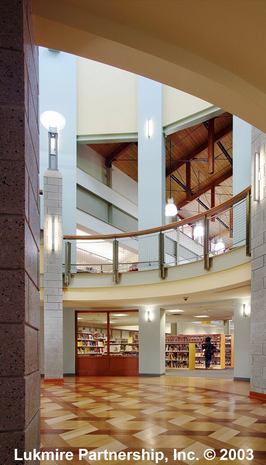
View from the young adults’ balcony overlooking the children’s area

Germantown Library view from children’s toward the young adult balcony
My hope was to perch the teenagers above the kids. They’d graduated, right? And we had tons of volume to make that happen. I was expecting someone to point out that the children’s room was taller than that for the adults. No complaints filtered back.

King post trusses rule!
A series of exposed trusses, in a modern reinterpretation of a king post truss span the open spaces on both floors. If you squint, the upper truss members run though to the overhanging roof beyond, like Green and Greene did theirs. And the sprinkler lines (painted black) are held tight to the structural wood deck to be less obtrusive. The metal halide lighting predates the invention of low voltage LED lighting.

Germantown Library rotunda staircase
Conclusions and Critique
What might we have done differently? Oh, let me count the ways. Prayed more and yelled less?
Or maybe what we did in a later library–employing more extensive wood structure–this time working with a younger project architect, a woman who debated everything yet got it built. The much later Olney Library (again for Montgomery County) would develop better wood detailing, not perfect but the best we could do. Sandra Watts, AIA got it built.

Gamble House, Pasadena, California, by Charles and Henry Greene, 1908 photo by Mr. Exuberance, 2005