
B&W Minimalism vs. Full Color

Yellostone bird—photo by William E. Evans, ©1998
A recent post on Medium caught my eye: Why Finding a Niche and Simplifying Is Better Than Being a Generalist by John Weiss.
I’ve followed Weiss for several years now and he rarely disappoints. His article is about the creative process and intuition, and how they combine in the mind to create a piece of art. It is also much about the necessity of clearing away distractions. One hopes the mind will, at some point, create the spark that leads you to completion, though it’s rarely a sure thing.
Weiss uses Ansel Adams’ inclination toward black and white photography—along with his own black and white cartoons—as prime examples of how the discipline of minimalism can concentrate the art. Where he calls it a ‘niche,’ instead I’d use ‘tradition,’ but that’s a quibble.
Less mentioned in writing about the glory days of B&W photography, i.e. before color, is the required equipment. Lugging a 8x10 plate camera and wooden-legged tripod on a Yosemite cross-valley shoot wasn’t an easy physical affair—nor fast. Mountain goat or not, even simply deciding when and where to plant the tripod was a commitment; where it was set was the essence of a landscape photograph’s composition. Some viewpoints are obvious—though arriving at the best time of day, with the weather gods looking down kindly is largely a roll of the dice.
Getting up with the sun, only to find it’s pouring rain, moping around with coffee and gloomy thoughts all day not speaking, then when you’ve packed it all in, the sun manages a spectacular sunset…
Whereas in an oil painting’s composition there’s endless flexibility, and gesso when you need to start over. The camera has only a stationary position—and when you see a better place fifty feet above you on that outcrip, climbing to it is the only option. I don’t use a tripod too often—even if the modern ones don’t weigh you down—it’s just one more thing to hassle with on a hike. The disadvantage—other than impatience—lies in not being able to shoot in extremely low light conditions.
In every photograph, there is an invisible yet ghostly reminder of the photographer, now absent, who once stood studying the scene you’re now enjoying. I like the thought.
B&W photography had grown up before color film became reasonably useful. 1935 saw Kodachrome film introduced—but it had to be mailed to Kodak for developing. When I began shooting lame shots in the 1970s, one still used different film for indoor shots to offset the yellow cast of incandescent light; the reverse problem existing for fluorescent lighting. Photographers either carried separate cameras loaded with different film or wasted a lot of film changing it. Early color prints were unstable, as anyone with old prints can tell you—for which Photoshop was invented.
For a professional photographer in the Middle Ages—vs, middle aged camera buffs—the difficulties in manipulating color film in the darkroom took away from the ‘art’ of development. Ansel Adams was known for his skill in a darkroom as much as his compositions. Dodging and burning are probably the best known traditional darkroom techniques.
“Originally, dodging and burning was used… to retouch film to enhance highlights, and deepen shadows on photographic prints. Photographers used simple darkroom tools to either allow more light… to reach certain parts of the light sensitive photographic paper. This was known as “burning in” which made these parts of the photo darker. The photographer could also dodge the light—hold it back from the paper—allowing that part of the photo to remain less developed or lighter than the non-dodged area.
“Using this method, photographers… could control with great accuracy the developing process to ensure that their prints displayed the full range of tonal values needed to make the photograph pop.”
from Digital Photography School’s Dodging and Burning to Create More Effective Black and White Images by Alex Morrison
On a trip to Carmel when we were first dating, D bought an Ansel Adams’ reproduction of a grove of Aspen trees as a present for my bare condo walls. Adams’ black and white patterning of the thin, vertical tree trunks is the first you notice, but studying it longer, it’s the depth of field that stays with you, that impossibly limitless forest of identical aspens receding into the distance.
Yellow aspens in the fall are stunning; Adams’ B&W photo asks you to think of something deeper.

Aspens in the Snow, Taos, N.M. photo by William E. Evans, ©1998
There’s an Ansel Adams photograph, Moonrise, Hernandez, New Mexico that is a good example of his quieter work, very different from his Yosemite glamor photographs. The modest adobe building plus the farm structures and miniature graveyard are set against—crushed by, even—by an ominous, cloud-filled sky. Either a thunderstorm or night is descending. You don’t need color to describe the distances involved, and it’s easy to imagine what life could be, living in all of that country.
“I had been photographing in the Chama Valley, north of Santa Fe… We were sailing southward along the highway not far from Espanola when I glanced to the left and saw an extraordinary situation—an inevitable photograph! I almost ditched the car and rushed to set up my 8×10 camera. I was yelling to my companions to bring me things from the car as I struggled to change components on my Cooke Triple-Convertible lens. I had a clear visualization of the image I wanted, but when the Wratten No. 15 (G) filter and the film holder were in place, I could not find my Weston exposure meter! The situation was desperate: the low sun was trailing the edge of the clouds in the west, and shadow would soon dim the white crosses. I was at a loss with the subject luminance values, and I confess I was thinking about bracketing several exposures, when I suddenly realized that I knew the luminance of the moon—250 c/ft2. Using the Exposure Formula, I placed this luminance on Zone VII; 60 c/ft2 therefore fell on Zone V, and the exposure with the filter factor of 3x was about 1 second at f/32 with ASA 64 film. I had no idea what the value of the foreground was, but I hoped it barely fell within the exposure scale. Not wanting to take chances, I indicated a water-bath development for the negative. Realizing as I released the shutter that I had an unusual photograph which deserved a duplicate negative, I swiftly reversed the film holder, but as I pulled the darkslide the sunlight passed from the white crosses; I was a few seconds too late!”
From Examples: The Making of Forty Photographs by Ansel Adams
ASA 64 film was most often used in full sun, a slow film speed to capture the rich, ahem, colors. A one second shutter left Adams open to blurring by the wind, or a poorly set tripod. And he got but the one shot before he lost the sunlight. Luck and a critical eye for composition created this one, though I’d loved to see a full color of that New Mexico sunset. I worship sunsets.
Eva Carter is an abstract artist we met accidentally, wandering into a small art studio in Charleston, South Carolina. On our honeymoon. I recall it was Sunday, and we were the only ones visiting. She was talking to a man with whom she seemed familiar, and we were free to browse the studio. I guessed it was his gallery, and was showing her work among others.
We took a monotype print home with us. Several years later in Santa Fe, we learned she was represented by the Joyce Robins Gallery. D was feeling flush. About an hour later, we’d paid for an oil painting that hangs on the only wall in the living room large enough to do it justice. I’d be curious to know whether Eva Carter is still as influenced by western landscapes. I’d love to know what the mortgage payment would be for the painting she’s poised next to on the home page: Eva Carter's Gallery.
As much as Adams’ best known style is tied to his B&W work, Eva Carter’s is color and sweeping motion.
Years later, we came across a photographer, Jana Epstein whose photo became an essay subject, Woman Who Lost Her Head. She follows a similar B&W tradition, though with a twist: she applies subtle tints to her B&W photos. The second of her photographs hangs at the stair landing in our house. It’s also currently given pride of place on her website: Forgotten Streetcar might be a name for it.
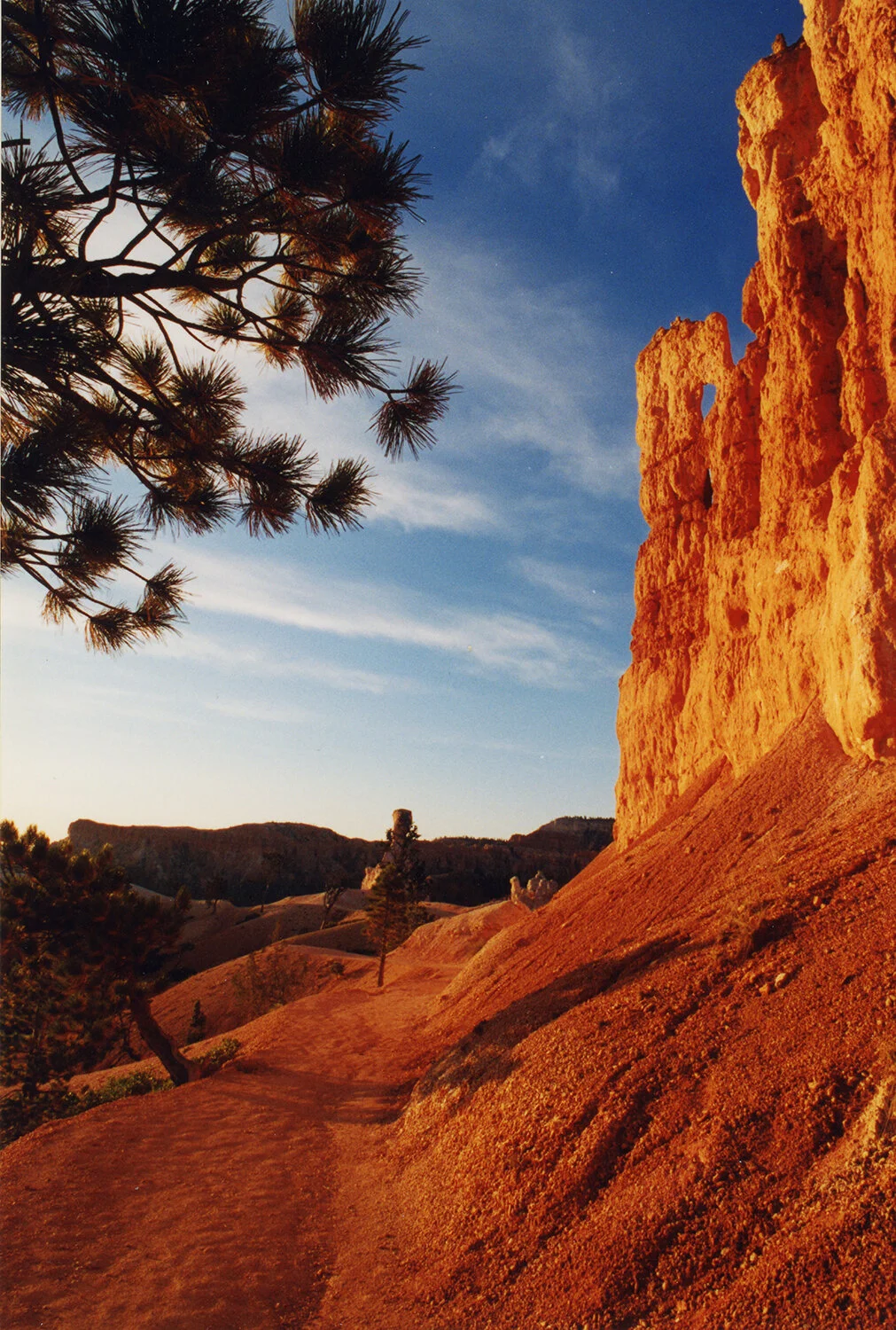
I’ve taken a ton of photographs as a tourist, nearly all in color. Since a wee tike, I’ve been drawn to sunsets, both the dramatic and prosaic—low angle sun striking rocks and trees, grass and ocean, the colors and shadows are what I’m after. I’ve even gone after a few sunrise shots. The sunrise photos I’m proudest of were taken on a freezing October dawn hike into Bryce Canyon, Utah. Like praying in church to witness that kind of light, though focusing a camera wearing gloves is impossible.
Bryce Canyon faces east, so by early evening all you get are dying shadows; the sun has already dropped below the cliff faces. Sunrise at Bryce can cleanse you of your sins—at least the artistic ones. The intensity of the colors, in hues of red and orange, is surrealistic.
Bryce Canyon is misleadingly named. Don’t think ‘canyon’—it’s more an escarpment face that’s eroded over time, with hoodoos abounding. I’ve heard Zion is the larger brother to Bryce. One day, one day…

Bryce Canyon Sunrise—photo by William E. Evans, ©1998
Bryce Canyon Sunrise—photo by William E. Evans, ©1998

Hoodoo Sunrise—photo by William E. Evans, ©1998
Yosemite is a different story. Hoping to capture low light at the bottom of a valley that deep seemed like chasing after the hoards, Adams and ten million tourists who’ve followed after. The link is here: Yosemite Gallery
Though, up on top—hiking the Tuolumne River—you can go nuts. The link is here: Hetch Hetchy
It’s probably just me, but the Yellowstone photos of the hot mineral springs were some of the best I took. Ridiculously easy: stand next to the spring, point at your feet, focus and shoot.

Yellowstone mineral waters—photo by William E. Evans, ©1998

Yellowstone mineral waters—photo by William E. Evans, ©1998
Sunsets at Sunset Grille in Duck are a favorite. The restaurant ain’t nothing to write home about, but the sunsets over the Sound are. I’ve taken so many, I can’t justify any more. The combination of flat water, sufficient cloud drama to reflect low angle light, and the extended views to the horizon in a place not so well known will always be a temptation.
The Army Corps of Engineers’ long quay on rusting red pilings running into the ocean has always been an ambition, but I’ve never gotten the shot that’s stuck in my head. For now, a sunset:

Sunset on the Outer Banks—photo by William E. Evans, © 2008
Color lives in the world around us. So why the passion for photographing the obvious? I need to be surrounded by reminders of how vibrant the world can be; I’m slow.
Though to be clear about my own contrary nature, as an architect I’ve been more the minimalist than classicist. When arriving at Yale, looking over the studio offerings, I skipped past the one offered by Allan Greenberg, the self-anointed classical architect cum guru. Boring. One can be a student of history without the urge to regurgitate it.
The recent story of the Fine Arts Commission, and the now-withdrawn presidential executive order requiring Federal building to be neoclassical is only important in demonstrating a moronic view of architecture. The Romans appreciated the earlier Greek architecture, but they adapted it to fit their needs. And all the revivals since then?
The little appreciated irony of The Truman Show was that it was filmed in an imitation small town, Seaside, Florida, the movie’s moral about shallow insincerity refuting the raison d'être of the place—a two-fer if ever there was one.
I’d rather restrict my building designs to compositions of mass, movement and light. Lou Kahn’s quote about sunlight falling on a brick is immediately apparent. A brick’s texture, the patterning of how the courses are laid, speak of weight, permanence and time.
And the colors change with the light. So I’ll always nod to Ansel Adams as a compatriot in minimalism, but will continue taking my photographs in color.