It's All About the Light
Near daily we walk Layla past several homes in the neighborhood we believe house hermits. Blinds tight, no one ever steps outside. Some are in their declining years, understandably enough, but isn’t that when you need to double down? Others just act like, ah, maybe Anne Rice was right? During the pandemic I saw surprised how many folks emerged who’d I’d never seen before out walking, then once the worst had passed they all disappeared again. ‘Get a dog and see the world,’ I wanted to tell them.
We orient ourselves by the light. is it day or night? Winter or coming on spring? That wind whipping up the leaf piles—bending over the poor daffodils; weather’s coming. I like a baseball cap to block the late sun—or the early morning sun. Oh crap, it’s raining. I’ll need a parka to walk Layla, and to dig out the dog towels from the closet.
…
I’m not claiming I was first to discover light falling on a wall. My sunlight mentor, bless his soul, was Lou Kahn—Louis I. Kahn to the world. Yalees liked the more familiar nickname, you know? But I sat on the floor beside my roommate, Lewis, and three hours later we both walked out awe struck. His ‘brick didn’t know its nature until sunlight fell on it’ did it for me, compressing the quote a tad. That day I knew I needed to go back to graduate school. It was time to get serious about architecture.
“Kahn excelled in art from a young age, repeatedly winning the annual award for the best watercolor by a Philadelphia high school student. He was an unenthusiastic and undistinguished student at Philadelphia Central High School until he took a course in architecture in his senior year, which convinced him to become an architect. He turned down an offer to go to the Pennsylvania Academy of the Fine Arts to study art under a full scholarship, instead working at a variety of jobs to pay his own tuition for a degree in architecture at the University of Pennsylvania School of Fine Arts. There, he studied under Paul Philippe Cret in a version of the Beaux-Arts tradition, one that discouraged excessive ornamentation.” from Wikipedia page on Louis Kahn.
Kimball Art Museum, Fort Worth, Texas—photo by Andreas Praefcke, Public Domain
Lots of Modernists thought concrete was great, but were clueless how to make it beautiful. Kahn considered concrete as virtuous a material as stone, and over a second career as an architect, being a professor starting out, he extended its use. His first commission was the Yale Museum of Art, and one of his last was Yale’s Museum of British Art.
Our structural engineering professor at Yale used Kahn’s Museum of Art British, then just a bare concrete frame under construction pointing to how Kahn gradually thickened the concrete frame from floor to floor, expressing how the loads were carried from a spectacular series of skylights down to the building’s foundations. Concrete, brick, stone, arches, all were Kahn’s tools to describe the effects of light.
If you’ve ever seen the TV scene of M.A.S.H where Capt. Pierce is helping Radar fake a knowledge of classical music—“Ah, Bach!” If you’re hoping to impress an architectural student in a similar way, you might mention “Kahn.”
…
I don’t remember being down about the overcast New Haven winters, only I recognized that soft, sad light that leaves few shadows—one way to experience light. Moving to the other extreme, I’m not about to worship the sun, except to thank it for the light. Five years in Miami was enough to convince me not to get carried away with sun worship, though I’ll confess the airline flight attendants all in an array of bikinis by the pool—where C and I lived for a few years—lightened my weekends.
I entered a design competition in Florida, for a summer camp on a flat, tabletop site on the edge of the Everglades. My first move was to elevate the dozen or so dorms in clusters around the dining hall, all floating a few feet above the marsh, and my next move was to wrap each in deep shaded porches so the tropical sun could bounce a million lumens indirectly into the rooms. Those images from growing up in the lowlands were beginning to settle in.
…
We humans like to containerize ourselves—burrowing physically before all else. Space and time we have no control over, but light can be an ally, provided we pay attention. So, thinking about an approach to a beach house facing close to due west, how’s that going to work? The first design had a kink in the main roof to catch the late sun on the wood, always a nice feature.
Living Room afternoon view—image and design by William E. Evans, ©2022
Flipping the main living spaces upstairs in search of The View is a common enough move. In our case, we needed the added height—though you can’t tell from the image because Revit doesn’t know how to render an interior past the glass. Maybe when I buy that gaming computer with dual gigabyte graphic cards I might get a better rendering in my lifetime. For the Lukmire office I bought one of those babies and it could render a 3D Max scene overnight to make an AI aficionado weep.
“One day, all of these punch cards will be software.” William J. Mitchell, Yale ca. 1970. He once said that, we both carrying our cards to the desk for a run. Well, true ‘nough, Bill, though we ain’t there yet, unless you’re Bezos’s kin. For the rest of the hoard, we’re still waiting.
AI can write your term paper, and why is that? Oh, yeah, you can market that shit. If you were thinking Twitter was bad, just wait.
The true artists of light are the ones who paint its passage. I’m not arguing we all should sit meditating in our yoga positions—because I can’t—but I do want to speak to recognizing light. Lou was arguing for fundamental materials—brick, concrete, wood, even steel—in an understanding how it might feel to live surrounded by these materials. Kahn taught so many acolytes and most he never spoke directly to.
…
You can identify a certain continuation in the development of this particular beach house, from first to second design there is a lot of wood. But the problem with the first design was its best feature—the stair ‘pavilion’—outside of the main part of the house. Leaving aside how it would get blasted by the sun every afternoon, you’d have to sit on the landing to enjoy that space.
Stair pavilion view—image and design by William E. Evans, ©2022
And the whole affair was more money than we wanted to spend. Less is more, as Mies Van der Rohe would insist, though in his case he didn’t mean frugality—Modern Architecture being never cheap.
…
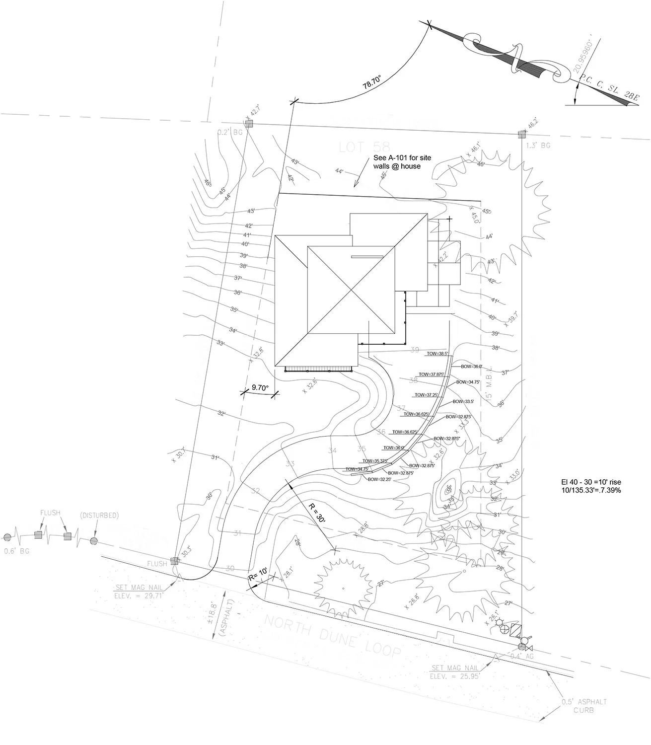
So returning to the source, I had this image of a room indulged by the view, yet being the heart of the house. And because this site lies where it does on a high ridge, there are views in all directions. Which is the reason the Outer Banks will draw me ‘till I’m dead.
Sitting on Jockeys Ridge in any season, any weather, is a form of meditation. It’s best when the tourists are gone, though even Layla prefers the inside when the weather’s that bad.
Site Plan—image and design by William E. Evans, ©2023
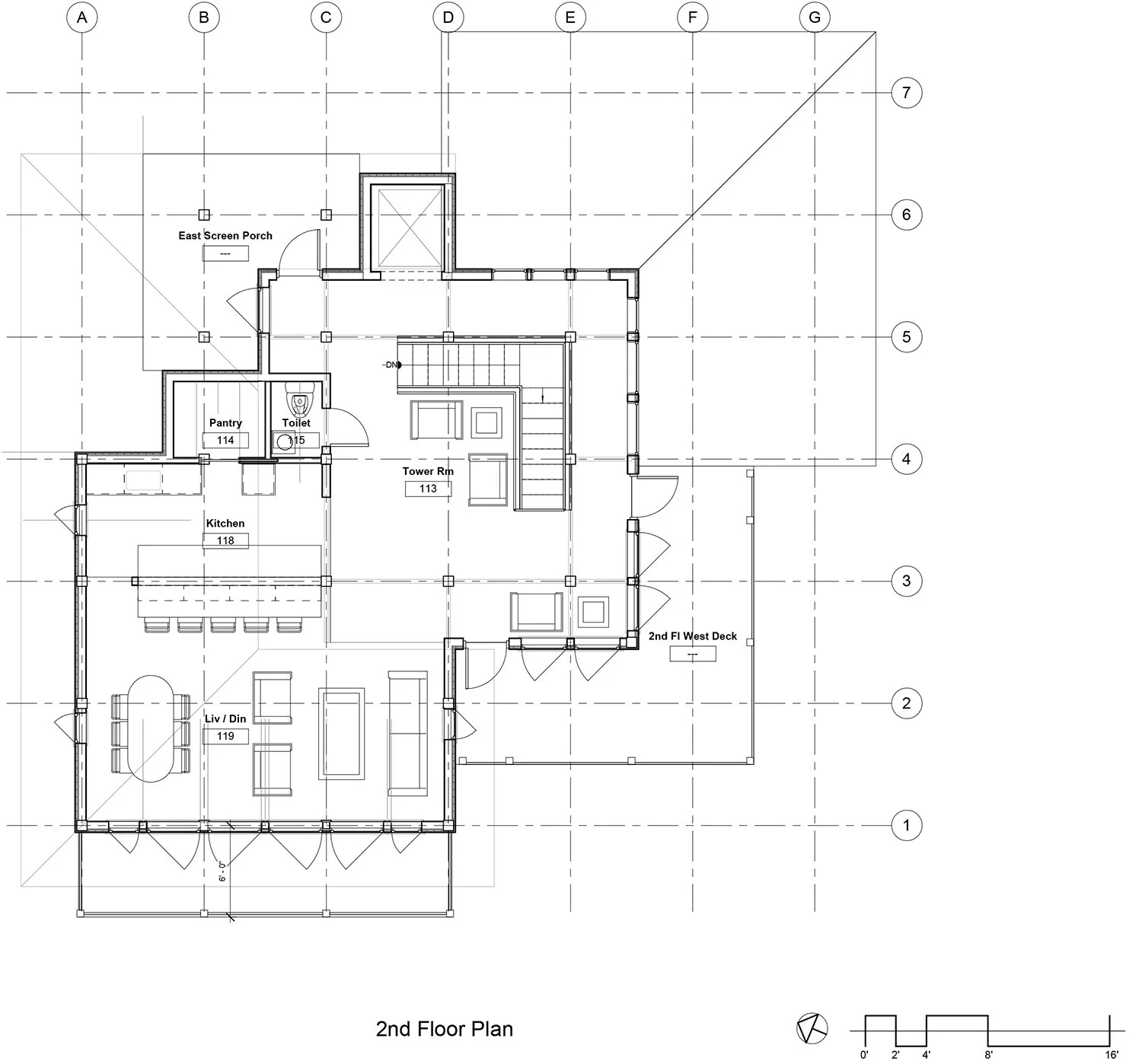
Image and design by William E. Evans, ©2023
2nd Floor view toward living room—image and design by William E. Evans, ©2023
2nd Floor view from living room—image and design by William E. Evans, ©2023
2nd Floor view toward kitchen & screen porch beyond—image and design by William E. Evans, ©2023
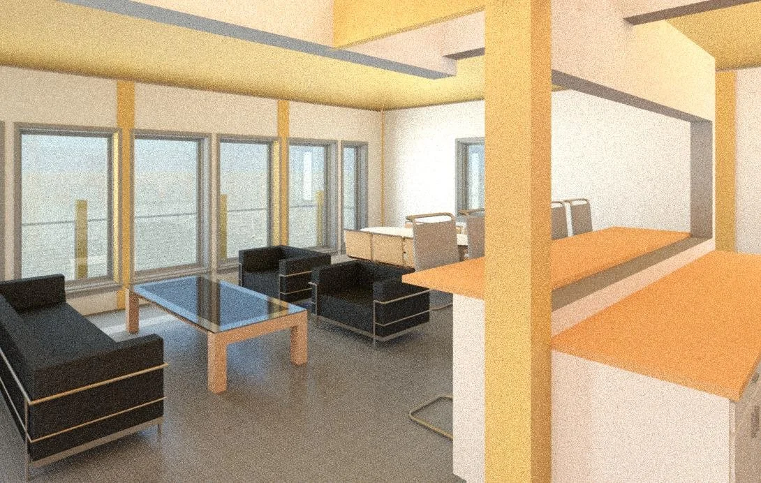
If there’s a weakness in the design— and there’s always something—it’s that this center space seems to outshine the living room with a very direct western view.
View into living room past the kitchen—image and design by William E. Evans, ©2023
The furniture is courtesy Revit—it’s all the software will offer. Probably not beach furniture.
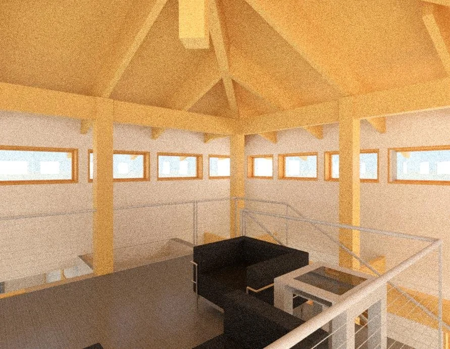
And I’m not satisfied with the Tower Room. I’m convinced it could be an interesting space to spend time in, and more remote for climbing that far. It’s not a continuous glassed view—with all that wind coming at it, we’d need a strong structural frame to keep it from wracking like the beach house we rented last December. That, and the height limit dictated by the local zoning ordinance making for narrow windows. It’s a work in progress.
View of Tower Rm—image and design by William E. Evans, ©2023
And I haven’t even designed a decent staircase…


