Revenge of the Architect
I’m working from memory here, which is never a good thing—like those novels whose protagonist you only find out three-quarters through a 700 page tome—one of those like Franzen’s Freedom that you hoped would improve your cred among the literati—is an inveterate liar at which time you throw it across the room, hitting your mother’s favorite Chinese vase. The protagonist was the liar; the vase was innocent.
Henry N. Cobb. FAIA—we Yalies called him Harry—was the perfect example of a Boston Brahmin, along the lines of the toast attributed to one John Collins Bossidy:
And this is to good old Boston,
Home of the bean and the Cod,
Where the Lowells speak only to Cabots,
And the Cabots speak only to God.
My mother, like most Irish Catholics, could recite that verse at the drop of a shillelagh. She took delight in stories ribbing upper class pretensions.
To me, being not from New England and having not attended Exeter or Choate before college, calling the tall, very reserved and mannerly partner to I. M. (we called him I. M.) ‘Harry’ when he was obviously a Henry of the first order, felt awkward, I’ll confess.
“Henry N. Cobb was born in Boston, Massachusetts, the son of Elsie Quincy (Nichols) and Charles Kane Cobb, an investment counselor. He attended Phillips Exeter Academy, Harvard College, and the Harvard University Graduate School of Design.”
from Wikipedia article on Henry Cobb
“Say na more, say na more.”
First year, second semester grad school, I’d been moved into the second year curriculum, not because I was an amazingly fast or a brilliant student, but because Charlie (you guessed it) Moore was chair of the curriculum committee, and when I inquired whether my courses at Clemson might allow me to skip the rudimentary structures class, he proceeded to lop off an entire year of required structures and architectural history course work. To explain, the Yale School of Architecture accepted a wide range of undergraduates, from degrees in math to English, and turned out new architects from scratch in three years. I had aced architectural history under Dr. Cooledge—and muddled through math and structures though it took summer school to do it. I still don’t understand how the Yale faculty managed to select these people, but they had an unerring system. Even the Greek kid with fractured English and the effervescent girl from Lisbon. I should have stayed in touch with Maria.
Having graduated as an undergraduate in architecture, I was one of perhaps two or three in the class with such a degree. Moose, a country boy from Arkansas who liked overalls, was another outlier, and the reason I knew it was true was he produced gorgeous pencil drawings, unlike the Greek student whose first presentation at Yale was done in crayon—I’m not lying.
And I can’t leave out Wong from Taiwan who could draw rings around some professors, let alone his classmates. He was the one who, for his thesis presentation, strolled in about a week before it was due, laid out a sketched aerial perspective of an entire community of low-rise buildings, laid rice paper over that and proceeded to draw freehand in ink for the final drawing. I helped build his model, so I watched his entire process.
Wong gave our social group a slide show of his travels in Europe one night after dinner. One slide in particular showed a plaza somewhere in southern Europe running out to a cliff edge dropping off into the Mediterranean with no railing, and his dry comment was ‘no building code.’ When he got to the several beach shots of Nice and Cannes with the requisite nudes, we began teasing him, “Wong, how were you dressed?” The slide show ended with Wong posed stretched out on the beach, his camera bag strategically located and a broad smile, ‘the end.’
So Henry, er, Harry, like all the architects who led the semester-long studios, was a practicing architect, and because this was Yale, he was a well-known architect. My senior year at Clemson, when I came to Dr. Cooledge with a request for a reference, he offered to write a letter to Yale or to I. M., his former classmate at Harvard (that trade school up the road). I asked for the reference to Yale. As tempting as the NYC job intro was, I needed the master’s degree to practice architecture, to which he replied “Good choice.”
Sitting with hundreds of my closest friends in the Yale Law School auditorium to hear Vincent Scully (we called him Vince) lecture on the Shingle Style, I was smiling to myself, remembering Dr. Cooledge’s preaching hellfire and brimstone like a Southern Baptist minister in his belief of a moral universe. At Clemson, he was strictly addressed as Doctor Cooledge. He struck terror in the hearts of architectural students for his exams; I loved the man, even before he got me into Yale.
The Yale studio Harry conducted was an urban design project to be set in downtown Boston on the block with the Parker House Hotel, one of the old line Boston hotels. We were to consider the entire block as the project site. A block from City Hall’s windswept plaza in one direction, the Old South Meeting House in another, and two blocks northeast from Boston Common.
Downtown Boston—Google Maps
Our site tour was done in freezing weather; no surprise given this was Boston, and the complaints about Boston’s City Hall Plaza being a barren wind-swept place we discovered were well founded. There were endless debates in the 70s on how the Boston City Hall Plaza should be reclaimed ‘for the people.’ Fifty years later:
“In June 2019, the city announced the start of construction of a $70 million project to transform the plaza into a ‘People's Plaza; that will include ‘a civic space for all residents, with universal accessibility, new civic spaces for all to use, increased environmental sustainability, and critical infrastructure improvements that will ensure the Plaza is safe and accessible for all for generations to come.’ The plans, developed by Sasaki Associates, include schematic designs for the project. In January 2020, the Boston Landmarks Commission approved the first phase of the project. Construction began in 2020.”
from Wikipedia article on Boston City Hall Plaza
The Parker House site tour included, not so far from downtown, the soon-to-be-completed John Hancock Tower designed by Pei Cobb Freed—Harry’s baby. It remains the tallest building in Boston, 62 stories, 790 feet tall. The Hancock Tower is an unapologetically Modern design, as is the rest of Pei Cobb Freed’s work. Unlike some of the lesser attempts at Modern design, it stretched the existing technologies for high-rise glass construction in its time. Seen edge-on, it was a slender spire with a racing stripe.
John Hancock Tower from the Charles River—photo by Tomtheman5, 2007
When I first saw the Hancock Tower, two things stood out in my mind. One, it was overwhelmingly well detailed, with a minimalist’s touch, a trapezoidal shape with no visible mullions, only a grid of glass reflecting the sky. And two, it was aggressively juxtaposed to all that was around it, particularly Trinity Church, a landmark in neo-Romanesque architecture by H. H. Richardson.
Trinity Church, Boston taken prior to Hancock Tower’s construction
image by Carol M. Highsmith - Library of Congress
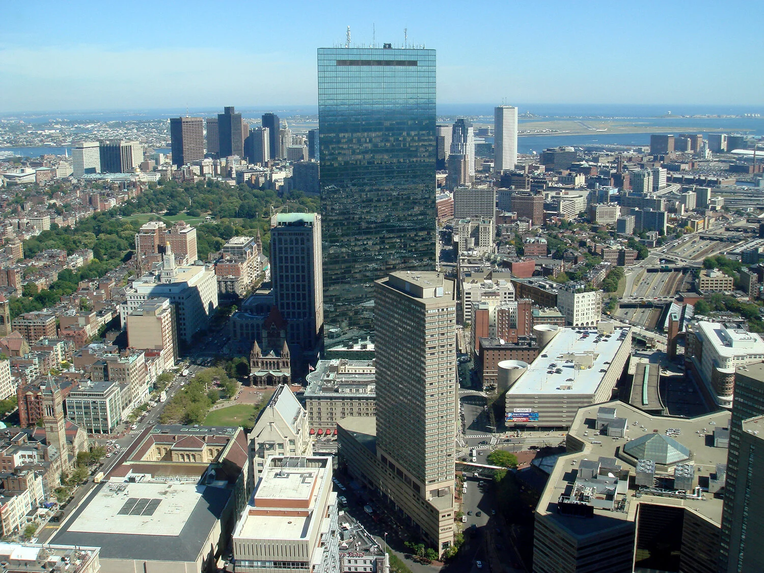
Aerial of Boston with the Hancock Tower—photo by Bobak Ha'Eri, 2007
Squinting, it’s that wee thing in the shadows to the lett, which has done nothing for the congregation’s love of the modern. In sunlight from some angles, all you see is a mirrored reflection and in others a ginormous entity.
“The John Hancock Tower seen from the Prudential Tower; on the left is Copley Square (and Trinity Church), to the upper left is the Boston Common, on the right is the Massachusetts Turnpike (I-90) and to the top right is Logan International Airport.”
from Wikipedia article on the John Hancock
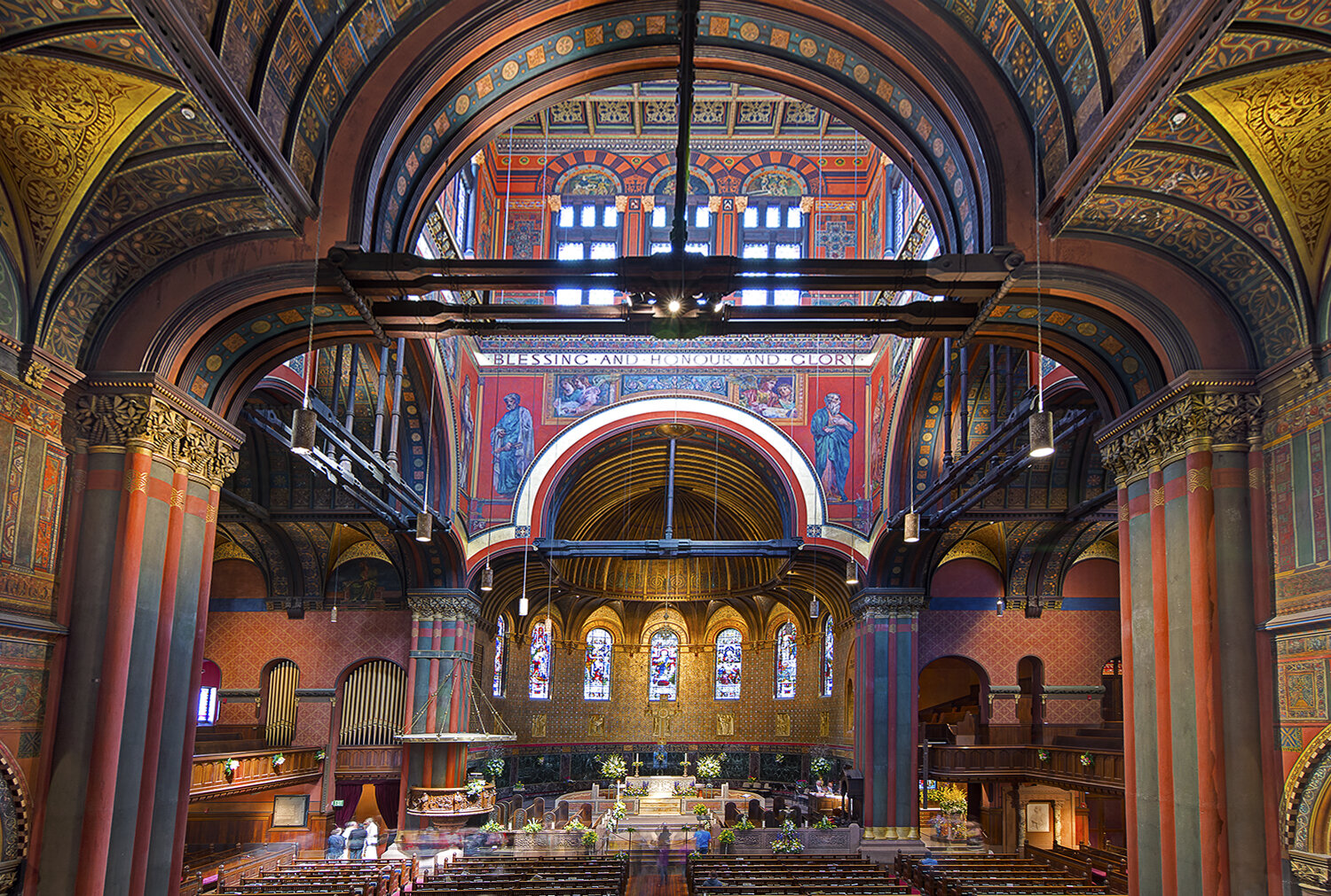
Good old ‘H H’ even with his capes, was one hell of a detailer back in the day when drafters drew on board. Allow me a photo of the polychromatic interior. Someone had to draw every inch of every elevation.
Interior of Trinity Church in Boston—edited photo by Bill Damon - https://www.flickr.com/photos/billdamon/14196229904
In the 70s, Yale was in the thick of the debate over Modernism. If not the birthplace of Post-Modernism. Vincent Scully preached against the crude 70s attempts at corporate Modern, how they wiped out earlier styles along with large swaths of urban history, all true. Robert Venturi’s Learning From Los Vegas was the product of a Yale research studio he and his wife/partner, Denise Scott Brown conducted. They took the class site-seeing in that god-forsaken desert place back in 1968. The book is stuffed with esoteric theory on semiotics and the modern age of advertising. With sketches and cryptic expressions, the book marshaled arguments against the ‘death star’ of Modernism.
Venturi conned his parents into letting him design a house for them so he could become famous. Now that’s real love. And real money.
Robert Venturi, Denise Scott Brown, and Steven Izenour are credited as the book’s authors, Izenour being a student in the class, and later their partner.
“Las Vegas was regarded as a ‘non-city’ and as an outgrowth of a ‘strip’, along which were placed parking lots and singular frontages for gambling casinos, hotels, churches and bars. The research group studied various aspects of the city, including the commercial vernacular, lighting, patterns, styles, and symbolism in the architecture. Venturi and Scott Brown created a taxonomy for the forms, signs, and symbols they encountered. The two were inspired by the emphasis on sign and symbol they found on the Las Vegas strip. The result was a critique of Modern architecture, demonstrated most famously in the comparison between the ‘duck’ and ‘decorated shed.’
“The ‘duck’ represents a large part of modernist architecture, which was expressive in form and volume. In contrast, the "decorated shed" relies on imagery and sign. Virtually all architecture before the Modern Movement used decoration to convey meaning, often profound but sometimes simply perfunctory, such as the signage on medieval shop fronts. Only Modernist architecture eschewed such ornament, relying only on corporeal or structural elements to convey meaning. As such, argued the authors, Modern buildings became mute and vacuous, especially when built for corporate or government clients.”
from Learning From Los Vegas by Venturi, Scott Brown and Izenour
Actually, Los Vegas isn’t a ‘non-city’ so much as it’s a pretend one—Disney World with booze, broads and slot machines.
Taxonomy? Semiotics?
“The semiotic tradition explores the study of signs and symbols as a significant part of communications. Unlike linguistics, semiotics also studies non-linguistic sign systems. Semiotics includes the study of signs and sign processes, indication, designation, likeness, analogy, allegory, metonymy, metaphor, symbolism, signification, and communication.”
from Wikipedia article on semiotics
Architects borrow from other fields, but at least they bother to look up the terms. Unlike the high tech geeks in Silicon Valley who never learned to write. Thus the title of this blog.
While at Yale, I was also taking a self-directed class in computer science. I proposed studying computer graphics, then in its infancy. I wanted to write a program to draw symmetry patterns, inputting a single line shape and have the computer draw patterns based on the 17 forms of 2D symmetry defined in crystal theory—esoteric enough, I thought at the time. The program was to be written in Fortran 4 or thereabouts. So I first needed to learn Fortran, not so difficult, at least not for the handful of commands I needed. Getting the program to work based on my poor punch card entries was a different matter. Suffice to say, the techs at the computer center hated me for the reams of paper spent, but Professor Frew passed me.
I saved that box of punch cards, but I have no idea what happened to the printout from the Yale Computer Center, where between runs, I and others played Lunar Landing, waiting on a tech to run our batches of punch cards. The game employed a small green screened monitor and keyboard—no mouse—running on a main frame computer. If you brought the space ship down too quickly, it crashed, and if you brought it down too slowly, it would drift off into space. The game ‘used up resources’ and so was banned—except for a future Apple programmer who buried the app deep in a main frame and scheduled it to reappear periodically. You had to be in the know.
So having geometry on the brain began to influence my design in the Harry Cobb studio. Not to prolong the suspense, I’ll say I took three hexagonal grids of the same size, and rotated each to align with one of the site’s three major streets, Tremont, Province and School, the last one fronting on the Parker House Hotel. Boston is an old city, and the blocks are only casually orthogonal. This gave me major building blocks at three separate angles, and left the street corners open, leading into an interior plaza. I can’t say the geometry exercise helped the design; it wasn’t nearly as clean as Cobb’s tower, but the overall assemblage, with the separate masses rotated at angles to each other, made for a nice model built from silver poster board. The underground garage levels were to employ a version of the grids in a space frame. Farm out, man.
Once every week, Harry would come through the studio to look at the work. Polite, polished with gentle criticism to the long-haired boy who was cheerfully laying layer after layer of white sketch paper down, designing until close to the due date. The jury consisted of Jaquelin Robertson, Peter Eisenman and Richard Meier, with Harry as moderator.
Yale juries, unlike the character assassinations held at Clemson, were fascinating debates among some of the country’s leading architects. I attended as many other juries as I could just to hear the debate. A good argument is always uplifting to the spirit.
I only remember fragments of this one. First, that Jaquelin Robertson—then-lead NYC planner under John Lindsay and later Dean of the UVA School of Architecture—knew his urban design, second that Peter Eisenman theorized in circles, and third, Richard Meier, famous for his white villas in the Hamptons, was damn well versed in urban design. I had though Meier was all style, but this jury corrected that impression. Eisenman was odd man out in the discussion.
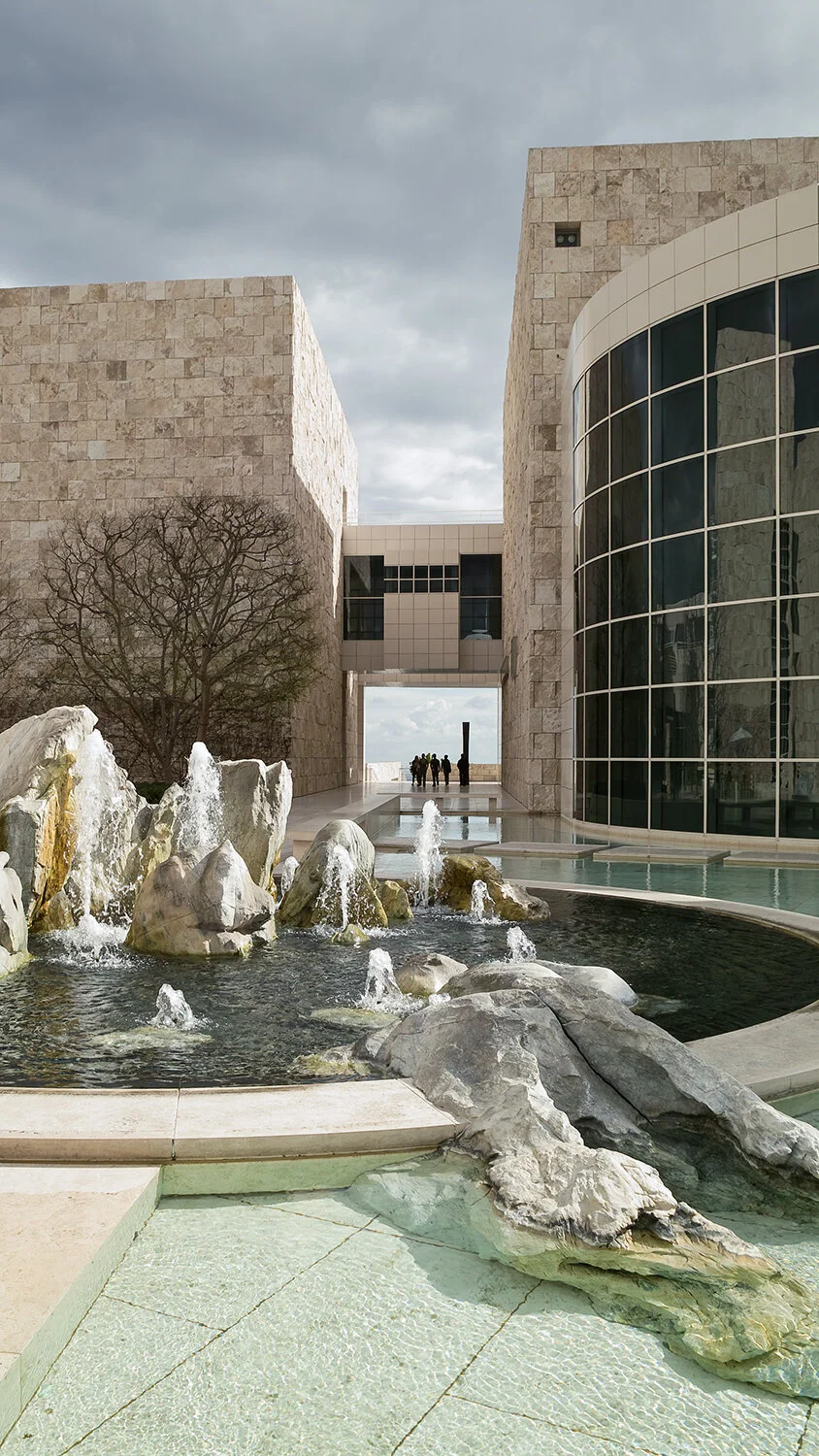
Much later, Meier’s design for the Getty Center overlooking LA should stand as a modern day Acropolis, as I’m sure he intended. I watched a documentary, Concert of the Wills: Making the Getty Center on the making of the Getty Center filmed in 1997. If you stumble across it, it’s worth watching, if only to see the standoffs between Meier and the then Center’s museum director.
Satellite image of the Getty Center—photo by USGS, 2007
“The circular building to the left is the Getty Research Institute. The two buildings at the top are the Getty Trust administrative offices and the rest is the Museum.” from Wikipedia article on Getty Center
“Meier has exploited the two naturally-occurring ridges (which diverge at a 22.5 degree angle) by overlaying two grids along these axes. These grids serve to define the space of the campus while dividing the import of the buildings on it. Along one axis lie the galleries and along the other axis lie the administrative buildings. Meier emphasized the two competing grids by constructing strong view lines through the campus.”
from Wikipedia article on Getty Center
Getty Center fountains—photo by Robert F. Tobler, 2009
A decently talented architect can make pretty elevations; it’s much harder to design buildings that speak to the public spaces they inhabit.
Architects like geometry. We like grids; some like lots of grids. The vertices tell the structural engineers where to place their columns.
Decades after Yale, I found a 30’x40’ orthogonal grid (3 to 4 proportions) with the 50’ diagonal being the same angle as the Purple Line track running across the site of the Silver Spring Library, warming my cockles tremendously. When the dull-witted civil engineers plotting the track alignment changed the angle on me, I told David Dise, the DGS chief client I’d rotate the building, no problem, and he freaked, so if you study the final alignment, the slight skew between building and tracks can be seen on paper. I should have kept my mouth shut and just turned the building.
John Hancock Tower Lawsuits
The Hancock Tower had to be Pei Cobb Freed’s worst nightmare in construction. In the year Henry Cobb was a visiting critic at Yale, his firm, Pei Cobb Freed was close to bankruptcy from defending the lawsuits flying. Construction problems began when the timber walls for the excavation collapsed and the mud from the pre-existing back bay wetlands slumped into the pit—causing settlement next door in Trinity Church and a multi-million dollar settlement. The contractor’s insurance company (not John Hancock) had to eat that one.
Far worse were the glass panels that blew out, sending glass falling several hundred feet. It got lots of architectural press at the time. Here was Cobb’s tribute to modern glass technology blowing out from top to bottom. And he was quietly going desk to desk, critiquing wise ass students when he probably should have been elsewhere. I liked him for that—he didn’t hide and he didn’t make his problems ours.
The failing (and falling) glass was ongoing. First suspicions focused on the acute angle corners of the trapezoidal shape. Did the acute angles create wind pressures exceeding the capability of the glass—disproved by panels breaking in random places away from the corners. Then, that the failures were occurring at wind speeds between the increments that had been tested in a wind tunnel, that the glass was inferior, the design itself was flawed and so on. The restaurant next door sued when the outdoor seating was hit, so John Hancock bought them. John Handcock in turn began suing everyone involved, contractors, glass manufacturer, architects, engineers, anyone their lawyers could find to serve.
That’s the way of it. When something goes wrong on a construction project, everyone including Santa Claus gets sued. In my own years as a partner, some nights were sleepless over the worry. We were sued directly only twice in thirty years, but were also involved in our share of owner-contractor disputes—the lawsuit involving the Shirlington Library went to the Virginia Supreme Court. The contractor lost, though we still donated our insurance deductible. That same case, the contractor’s lawyer refused to change the date of my deposition, given it was the week of my honeymoon. It took a pleading to the judge—who didn’t like the lawyer—to order him to change. Another sleezy lawyer had her license suspended for hiding evidence. As Tom Connell, our attorney in that case said, “don’t confuse the law with justice.”
Though when you’re in graduate school, these things seem far from anything important.
The Hancock Tower fiasco no doubt set back Pei Cobb Freed financially and strained the partnership, they survived, going on to design the East Wing Art Museum (1978) in Washington DC, and the Louvre entrance pavilion (1988), probably their most photographed work.
Louvre entrance pavilion at dusk w/ Arc de Triomphe in the distance—photo by William E. Evans, © 2012
Architecture remains an art form intrinsically involving mentorship and patient, methodical work. Henry Cobb, in that single semester, showed how an out-of-fashion stoicism can be pulled off in style. Howard Roark my ass.
If you ever have the privilege of visiting the assembly space upstairs in I. M. Pei’s East Wing Art Museum, take note of the tetrahedral space frame done in poured-in-place concrete—the one where cabinetmakers were hired to building the formwork. Nice grid.
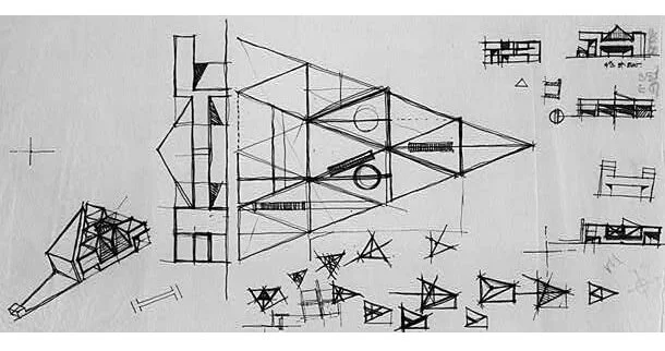
The National Museum of Art maintains a link to early Pei sketches of the East Wing: A Design for the East Building. In the sketch I like best, Pei is thinking about a 2:3 triangle, mimicking the angle between Pennsylvania and Constitution Avenues defining the site. And because he was working by sketch, Pei added the all-important entrance elevation just to the left of the plan. It was a favorite way to think about three dimensional space in 2D they were teaching as far back at the Ecole des Beaux Arts.
Pei’s early sketch for the East Wing—from National Gallery of Art, A Design for the East Building
The scattering of triangular skylights presaged the Louvre pyramidal entry pavilion.
West elevation of the East Wing Art Museum—from National Gallery of Art, A Design for the East Building


